About
Visual design is about more than just making the interface look pretty. The user’s eye should be drawn to the correct information and functionality. It is also a visual designer's responsibility to make the product accessible. Here are some snippets of the work I did that highlights how a small UI change made the interface more usable.
What is Visual design?
Here are some slides from a presentation I did to the entire product team at my former company. It talks about what visual design is and why it is important to improve the user experience of any product. The talk was a great hit and I was appreciated by many.
_____________
Example 1
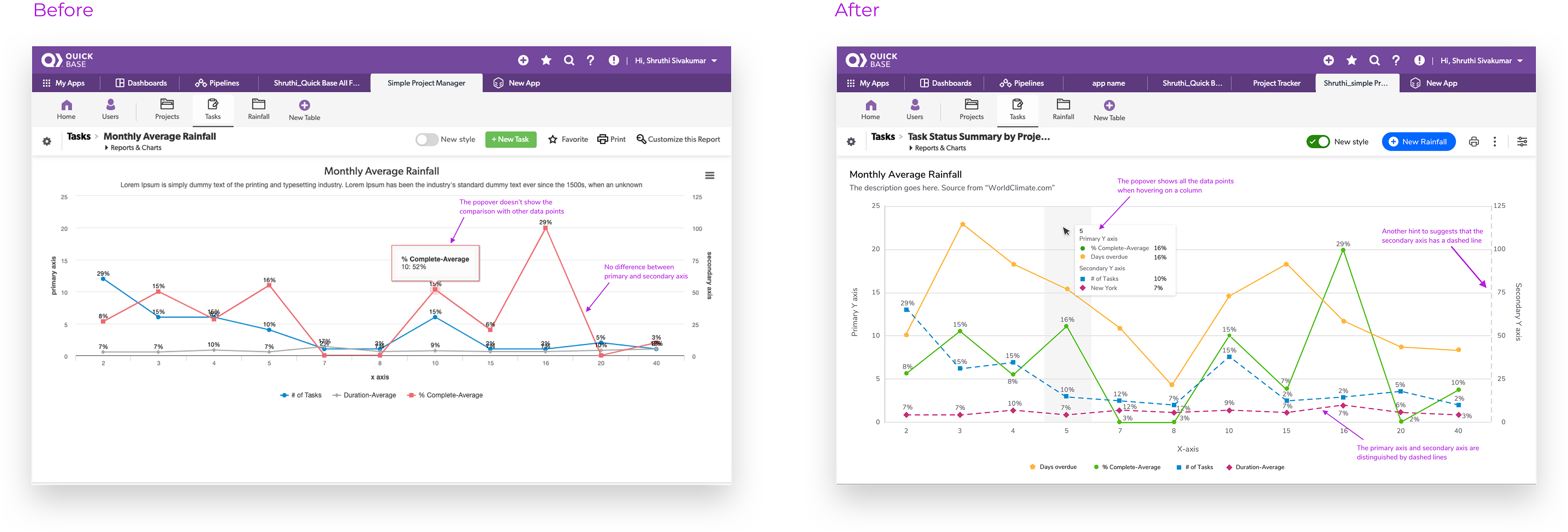
In the first image, there is no difference between the plots that use the primary y-axis (left) and the secondary y-axis (right). But in the second image, the plots on the secondary axis have a dashed line which made a huge difference in the user experience. The users can identify which data is on the primary axis and on the secondary axis just by looking at it.
The first image also does not show all the data points in the popover. The second image, though, shows all the data points in one popover which makes it easy for users to compare the data.
_____________
Example 2
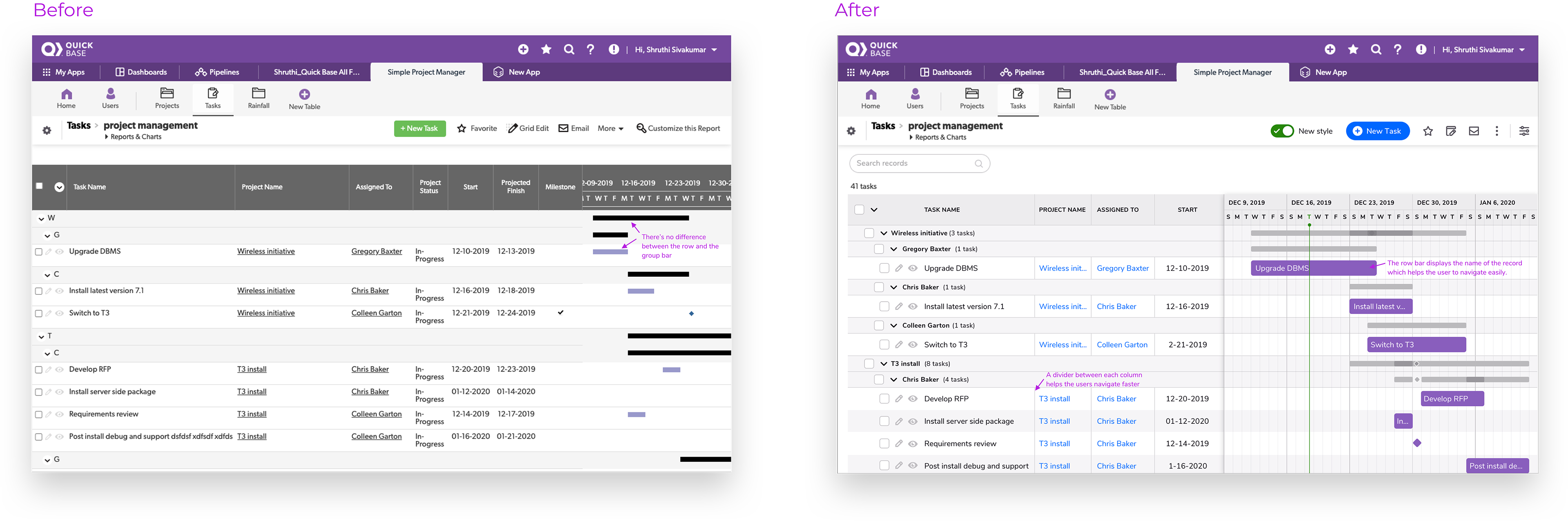
In the first image, the timeline bars are small. The improved second image is much more organized in presenting the data with dividers in between columns and zebra stripes for rows. The timeline bar also displays the record name which helps the user scan data quickly.
_____________
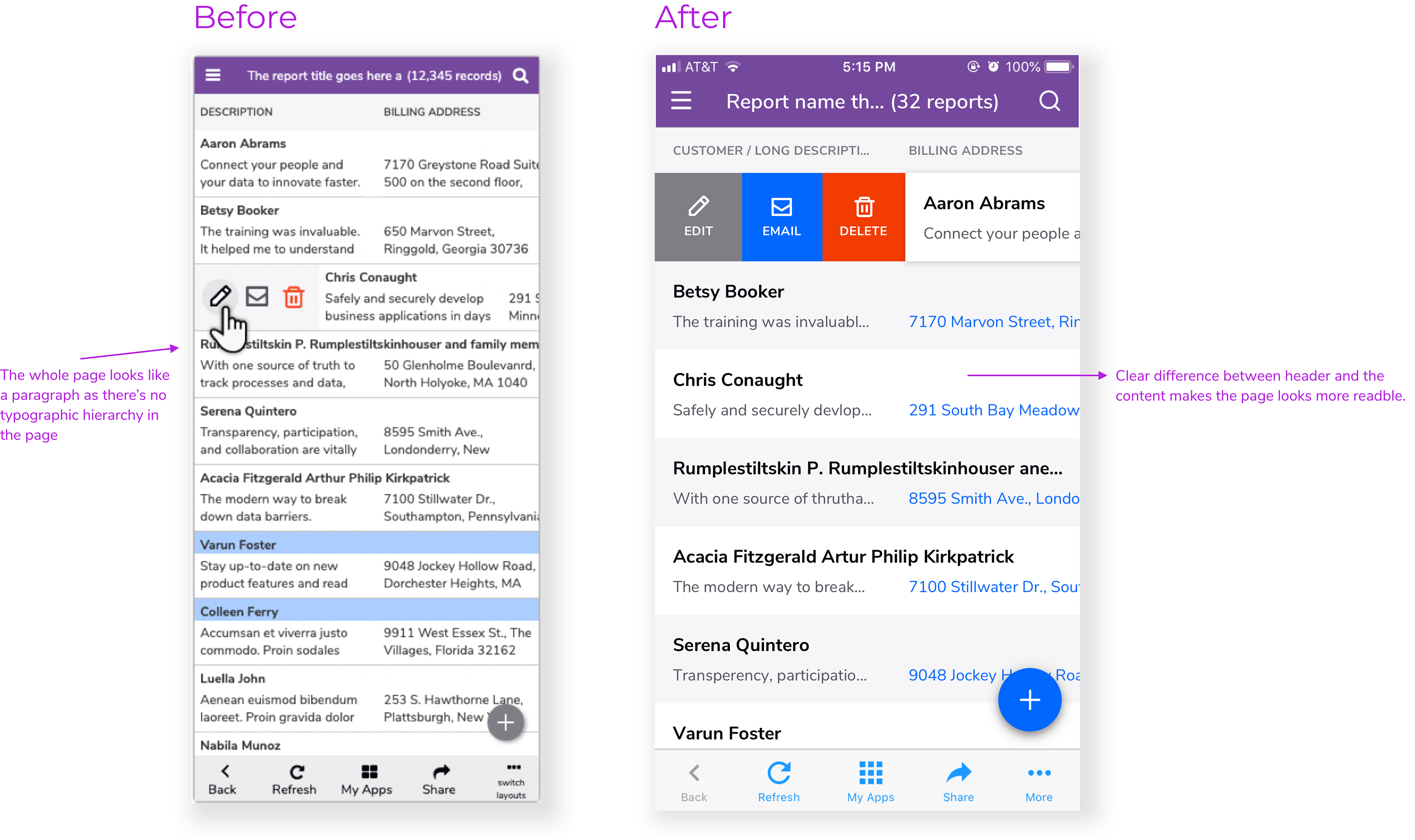
Example 3
Before the redesign, the table looked like a big paragraph with no hierarchy in the text styles. Users found it hard to read the table. After my redesign, more space was introduced. The headers were made bold and there was a clear difference between header and the content. This vastly improved the readability of the page.
_____________
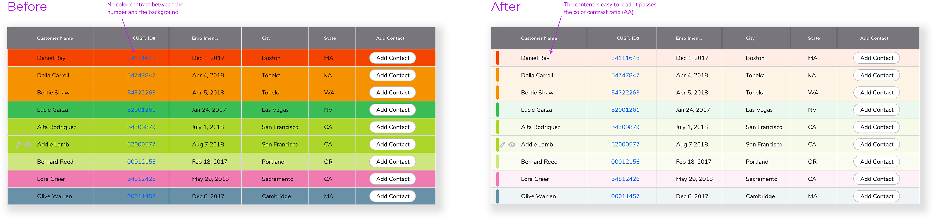
Example 4
The first image is difficult to read with no color contrast between the text and the background. As the colors are set by the users there was no restriction on what colors can be chosen. So the second image has an alternative solution where a colored bar was introduced on the left with opacity in the background. This makes the content easy to read and it is also accessible as it passes the color contrast ratio.
The first image is difficult to read with no color contrast between the text and the background. As the colors are set by the users there was no restriction on what colors can be chosen. So the second image has an alternative solution where a colored bar was introduced on the left with opacity in the background. This makes the content easy to read and it is also accessible as it passes the color contrast ratio.