MY ROLE
As the only designer, I was responsible for both the interaction and visual aspects of the project.
PLATFORM
Web - Desktop, tablet and mobile
TEAM
1 Product manager
1 Lead developer
4 Developers(co-ops)
1 Content designer
Background
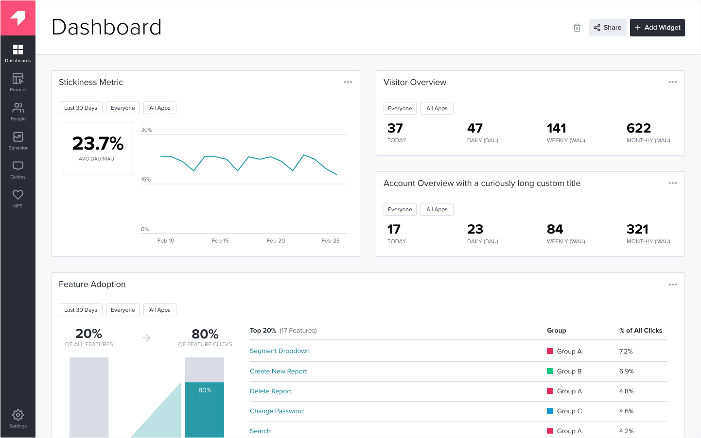
I previously worked for Quickbase, a no-code / low-code, PaaS platform. With Quickbase you can build apps through which you can store, track, and report data. During my time at Quickbase, I was involved in a project called Platform insights. Through this project, administrators were able to collect insights into the usage of their applications.
Identifying the problem
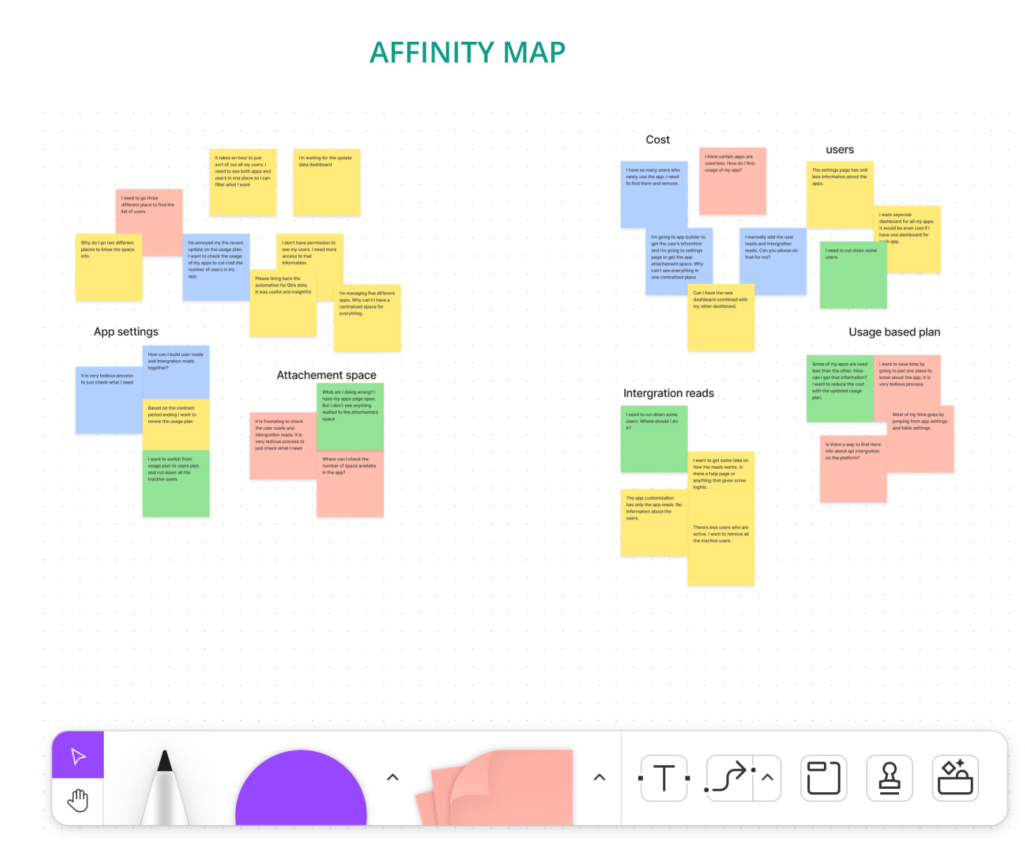
Through the Quickbase feedback portal, feedback was collected specifically targeting admins. These were organized through affinity maps to find a common theme among them.
The Problem
Administrators of apps built through Quickbase often felt lost and confused when it came to dealing with information about app users. Administrators could not easily identify inactive users. Nor could they identify when they needed to upgrade their platform because of an increase in active users. The end result was that these administrators were stuck with expensive plans that they did not understand, and were consequently frustrated.
User Pain points
1. Navigating multiple places to get app insights
2. Less information about the app usage
Goal
App admins wanted increased visibility and transparency of their app. They wanted a centralized place to view their app insights. This would also help them minimize their costs.
Constraints
1. Deadline pressure:
As this was a co-op project with a 6-month term, there was a tight schedule to complete the entire project within that timeframe.
2. Limited significance:
Since only 0.1% of Quickbase users are administrators who use this feature, there was a need for extensive persuasion to incorporate it into the company's OKR.
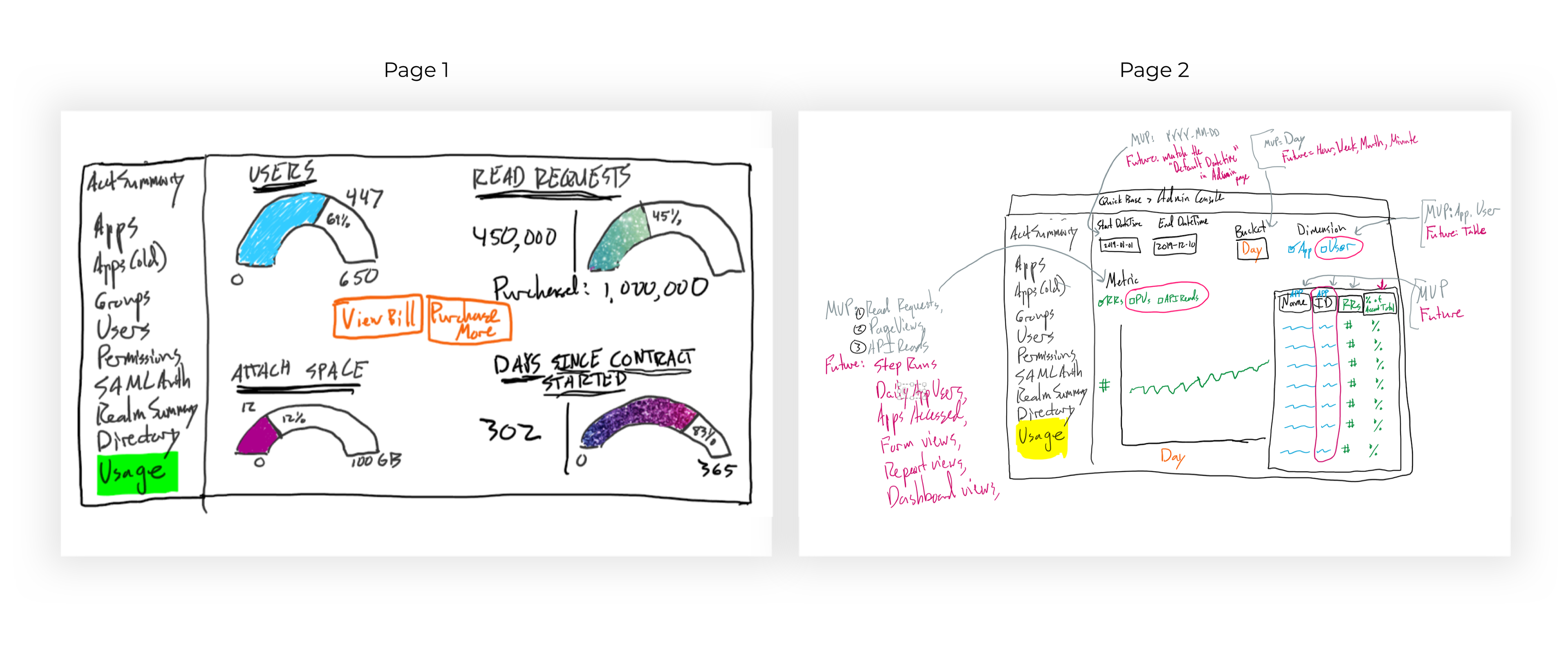
Initial draft
The product manager, lead developer, and I had a whiteboard session where we came up with two page wireframes. The first page is the dashboard that shows overall usage in a gauge chat and the second page is the drill down to get more information.
Challenges
I made a list of all the challenges as questions, and started answering each of them through in-depth research and surveys.
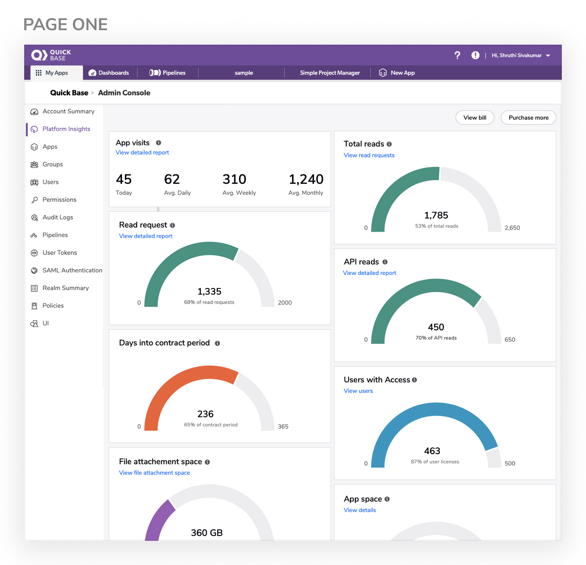
Page one
1. What is the primary information the user wants to see?
We(The project manager and I) did a survey through Pendo to understand what customers want to see in the tool. Pendo is a third-party analytics tool through which you can display a survey to desired user groups.
1. What is the primary information the user wants to see?
We(The project manager and I) did a survey through Pendo to understand what customers want to see in the tool. Pendo is a third-party analytics tool through which you can display a survey to desired user groups.
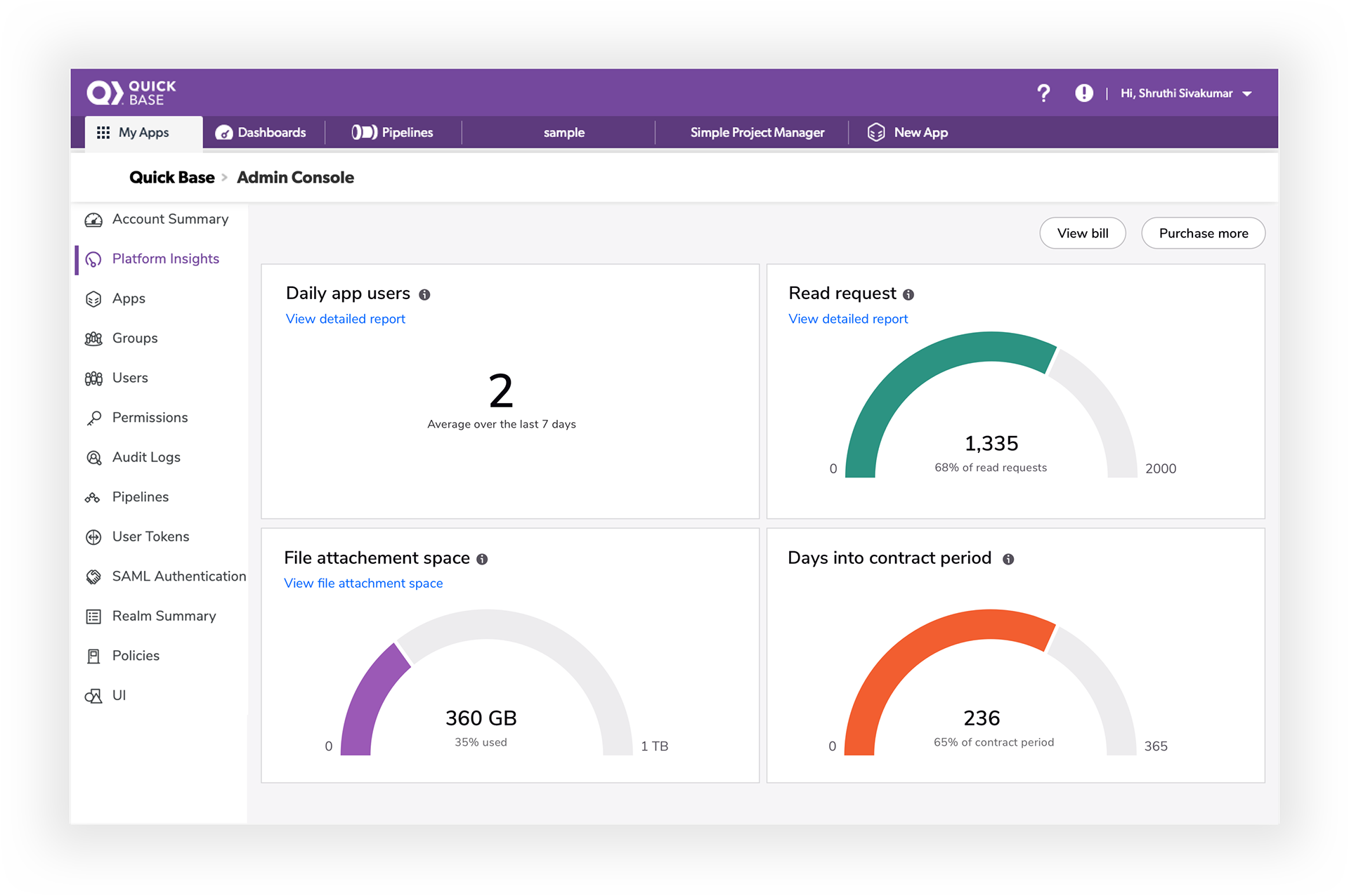
We received a wide range of feedback. But for the initial MVP, we picked four and began expanding from there:
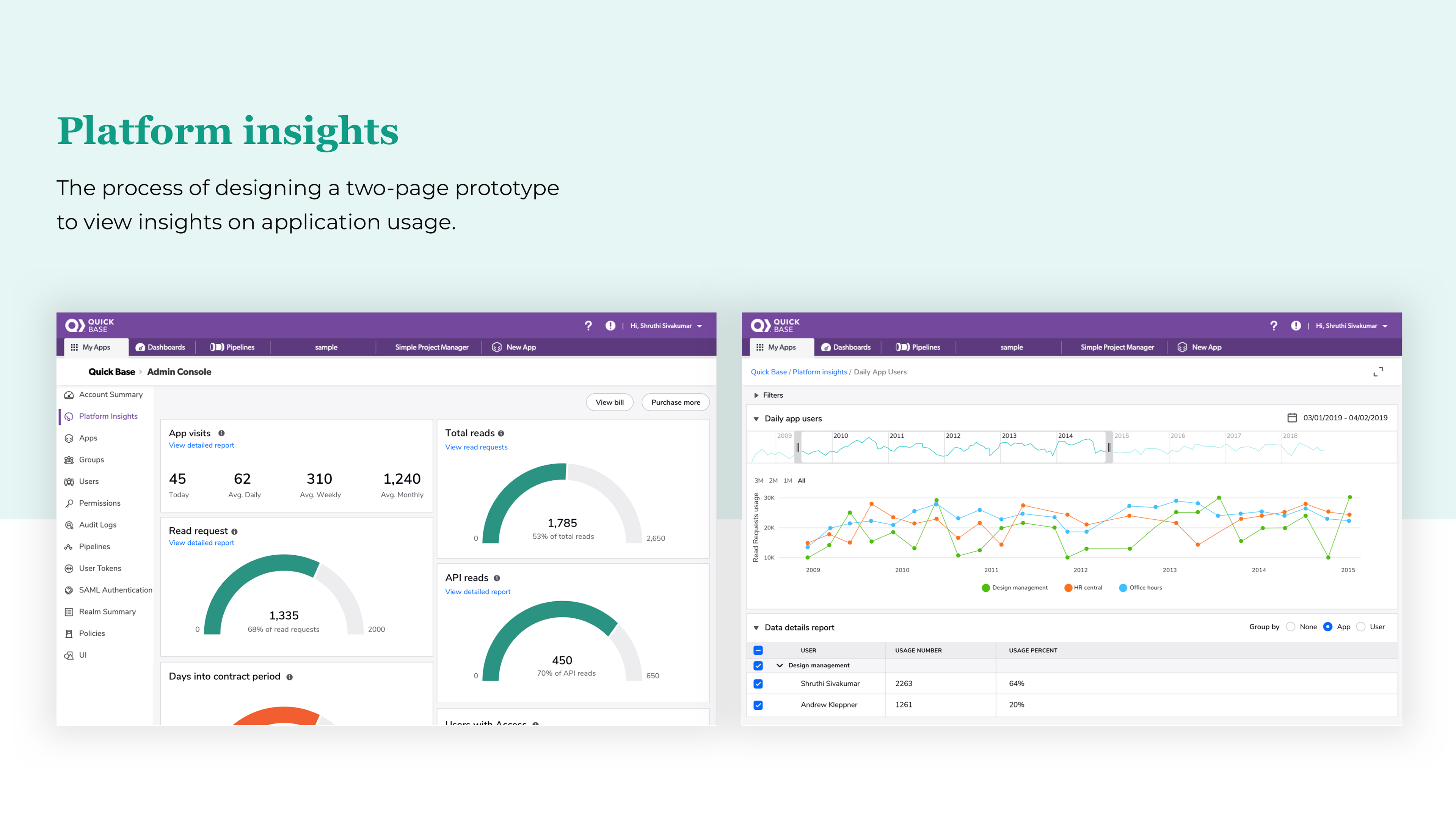
- App users (Number of users that access each app each day)
- Read request (Total number of user reads and integration reads since the start of the latest contract)
- Attach space (Amount of file attachment space that your apps currently use, compared to the amount purchased)
- Days since the contract started (Number of days elapsed since your current contract period began, compared to the total number of days in this period)
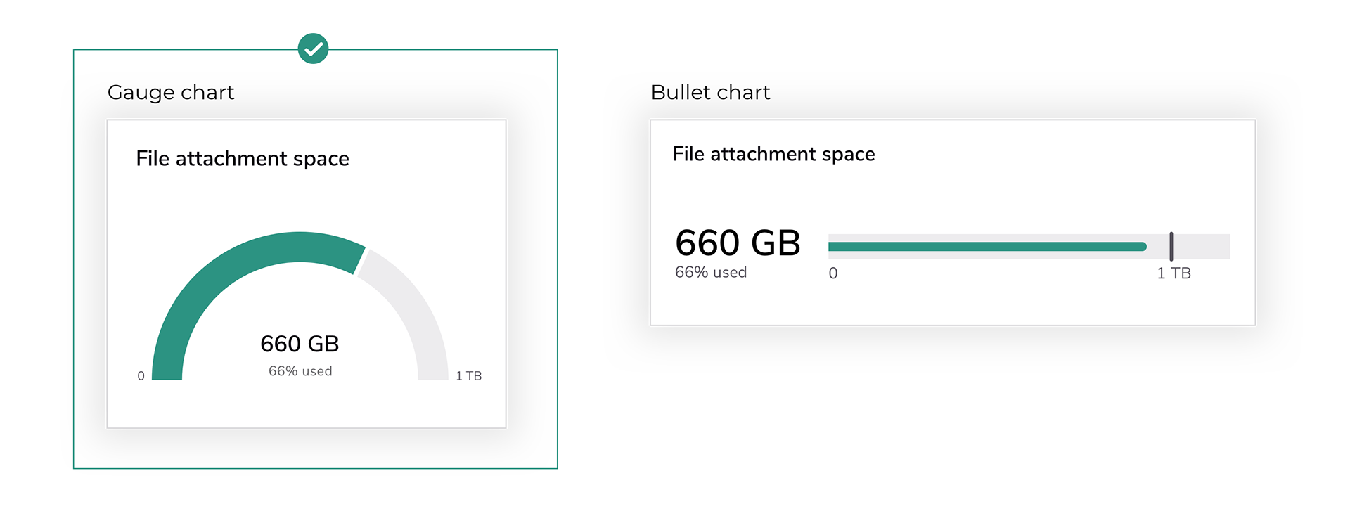
2. What is the best type of chart to display relevant data?
After researching various chart options, I identified two suitable chart types: the Gauge and Bullet chart. Both can monitor data usage progress and forecast budget projections. However, I ultimately selected the Gauge chart as it is simpler looking and easier to understand.
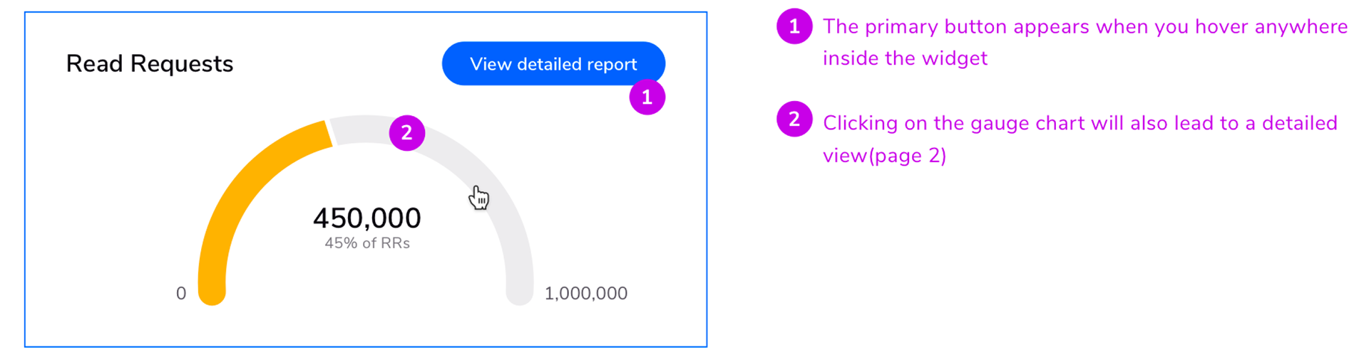
3. How does page one navigate to page two?
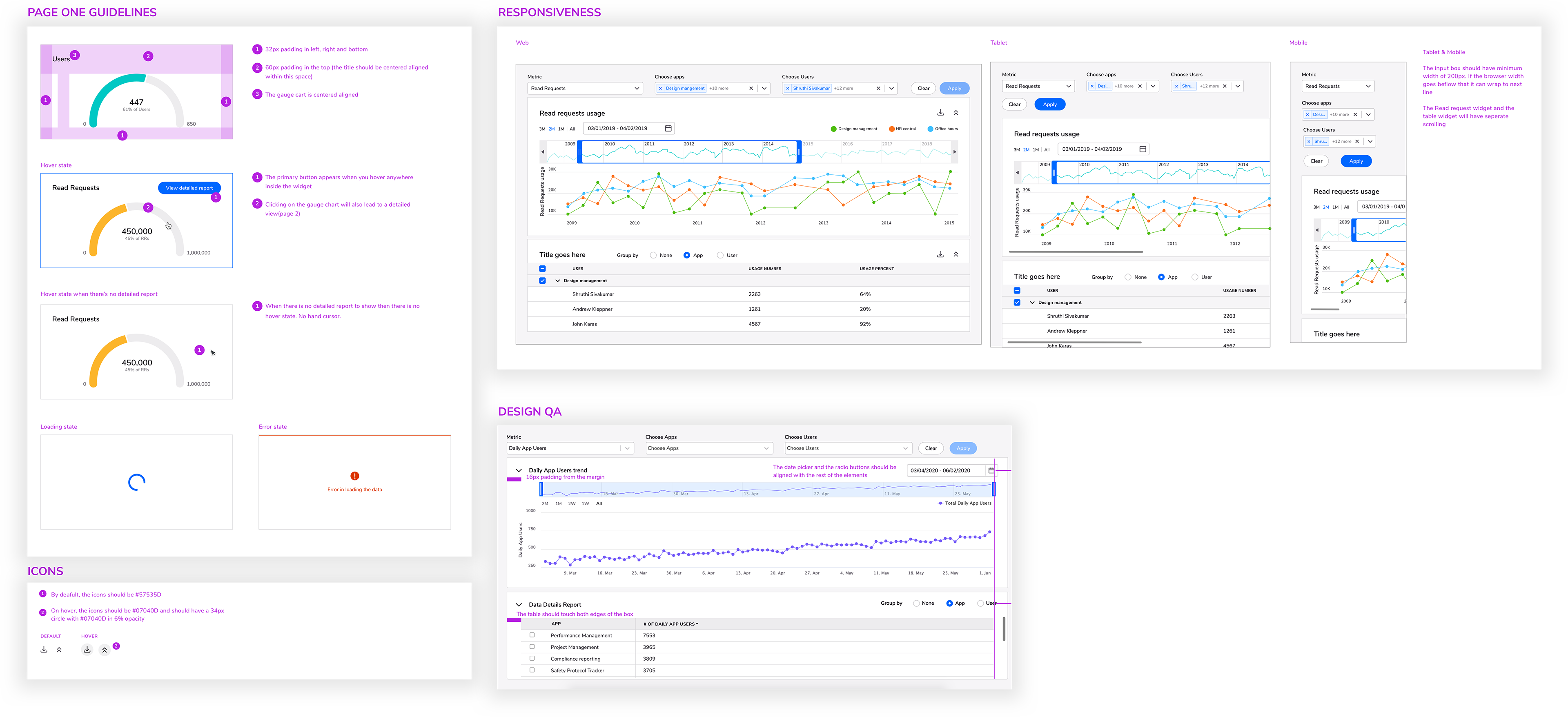
At first, my intention was to avoid creating a dashboard with multiple buttons that could be overwhelming. Therefore, I decided to display the primary button only when the widget is hovered over. However, it is worth noting that this interaction was later modified following usability testing.
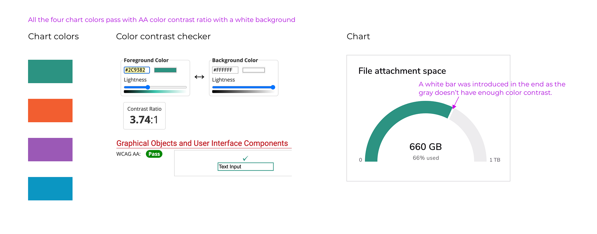
4. What colors are best for the charts?
Brand colors were used for the gauge charts. The colors were also grouped based on information. For example, app-based information was displayed in one color while user-based information was displayed in another to prevent visual clutter. Moreover, the colors were assessed for compliance with color contrast ratio standards against the background to ensure accessibility.
Here's the final design of Page one
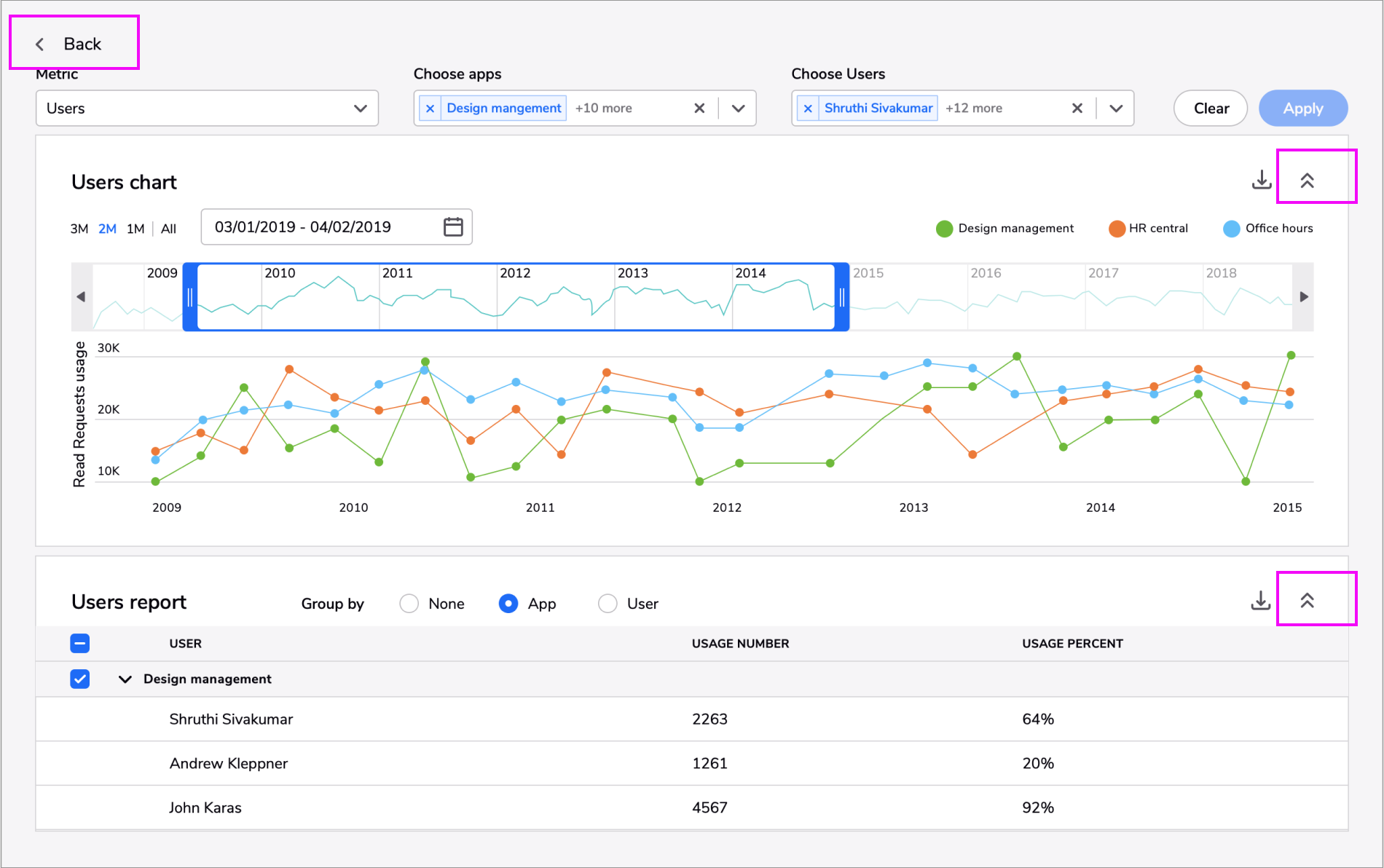
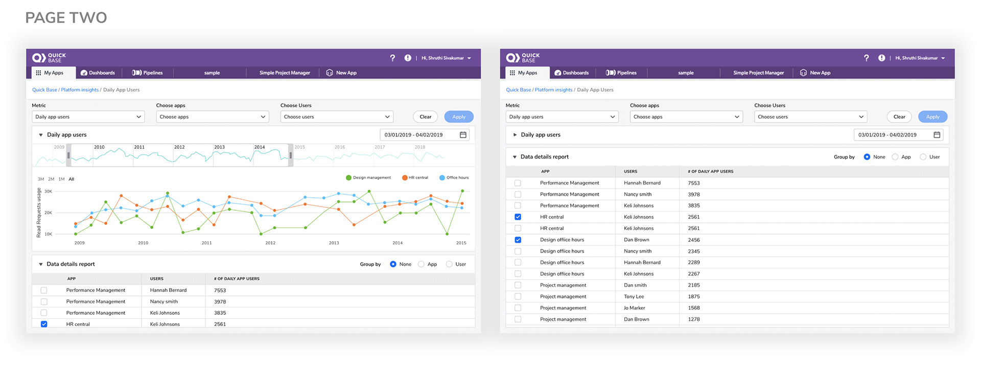
Page Two
5. How do we show all the data together on one single page?
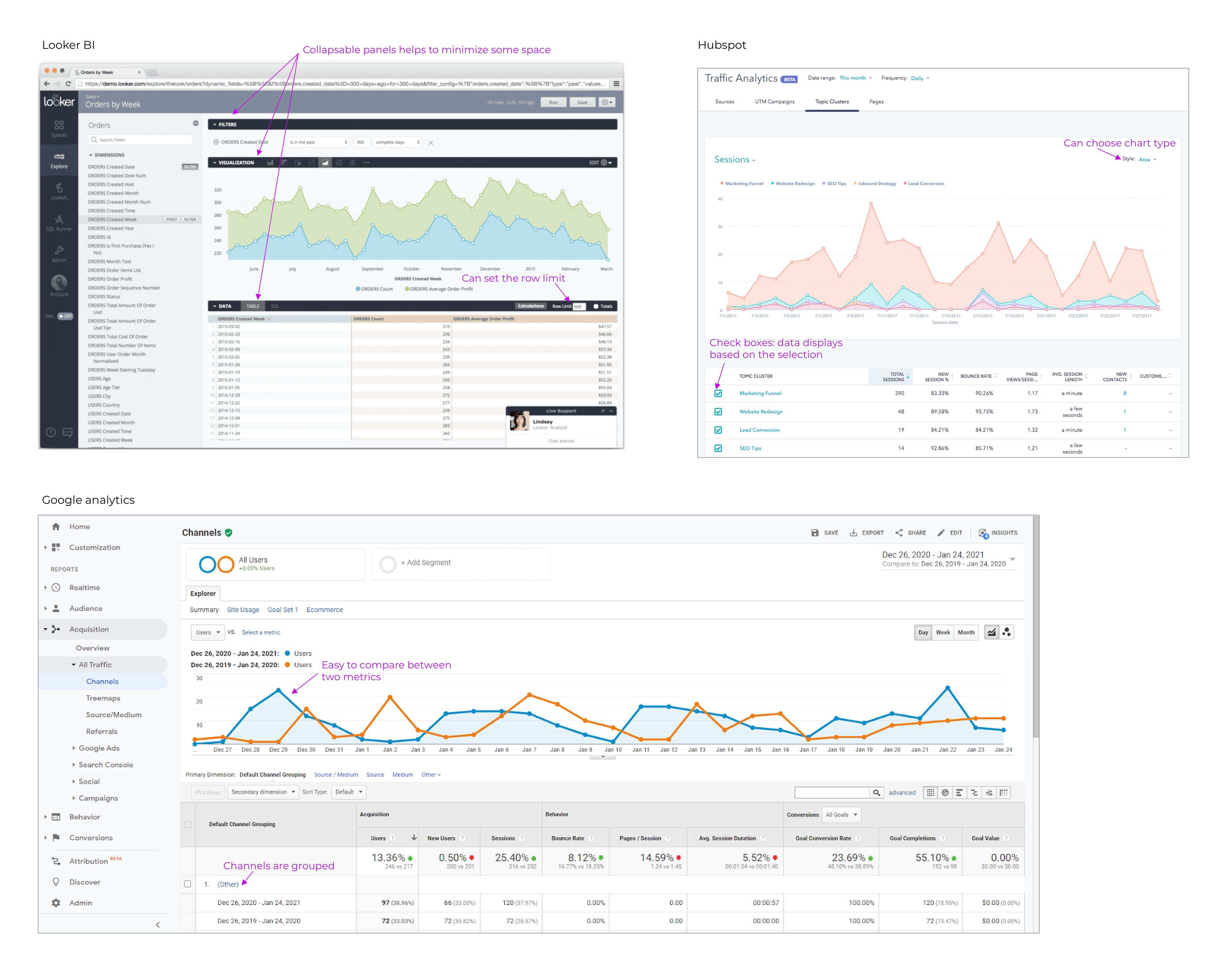
I did a competitor analysis to see what other products in the market use the drill-down page in their platform.
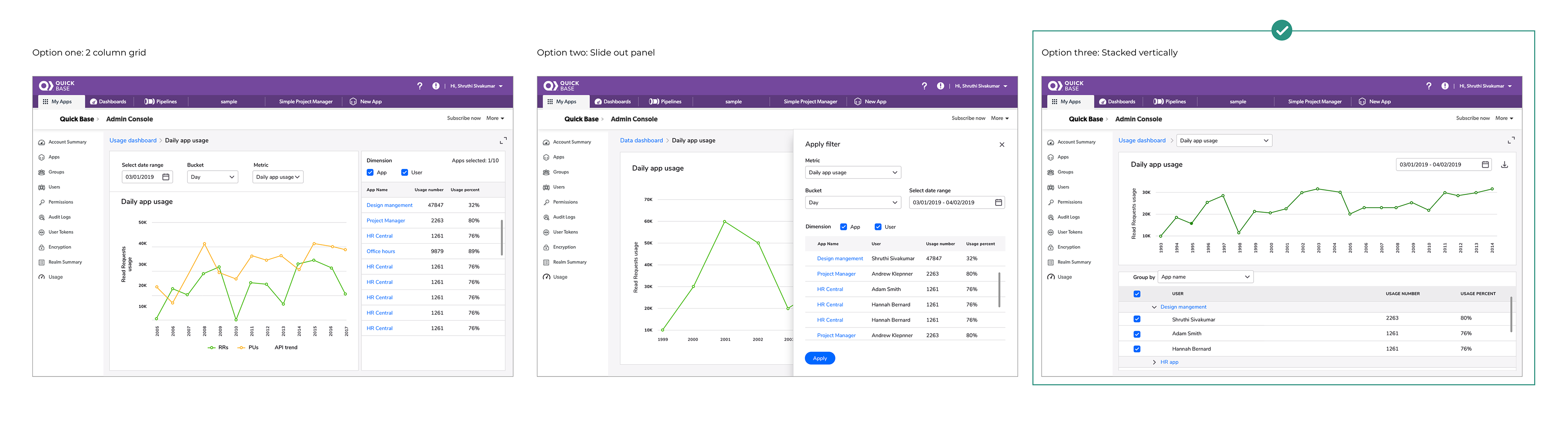
6. Which layout is best to display both graph and table report in a simple, organized way?
I designed three different layouts and presented them to fellow designers to get their feedback. The design where both table and graph have equal emphasis was selected.
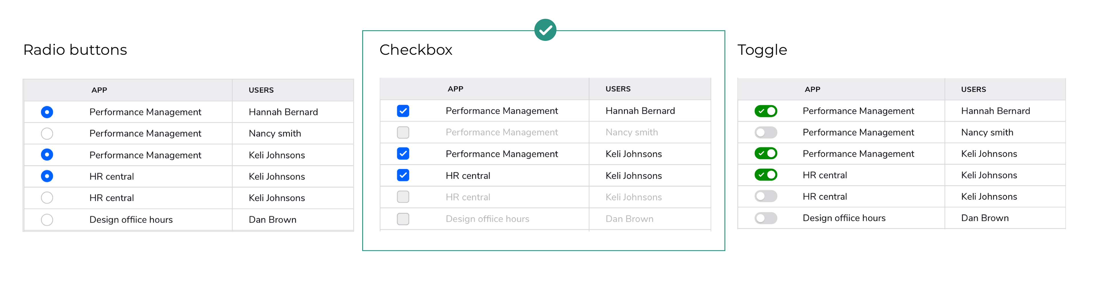
7. How do we let users know that they can see only three apps or users at a time?
Radio buttons: The common pattern for the radio button is to allow the user to choose only one of a predefined set of mutually exclusive options. So we do not want to differ from the already established pattern.
Toggle: According to the Quickbase design system, the toggle should be used only for on and off states. For example, switching between two different views. So we ruled out toggle as well as it doesn't follow our design system.
Checkbox: The checkbox works best for this scenario as the user can select multiple options. But we also want to let the user know that only three are allowed at one time. So once the user selects three options, we disable the others. The user can select another option only if they uncheck a box.
8. There are a large number of users and apps for an administrator. So space was the biggest concern. How do we minimize space?
Initially, both the top bar and the side bar were present on the first page, but we opted to remove them and replaced them with a breadcrumb located at the top. Furthermore, we implemented a collapsible panel to maximize the space allocated for the graph and table.
Usability testing
Another designer and I conducted a usability test with six participants. They were asked to perform three different tasks on both page one and page two.
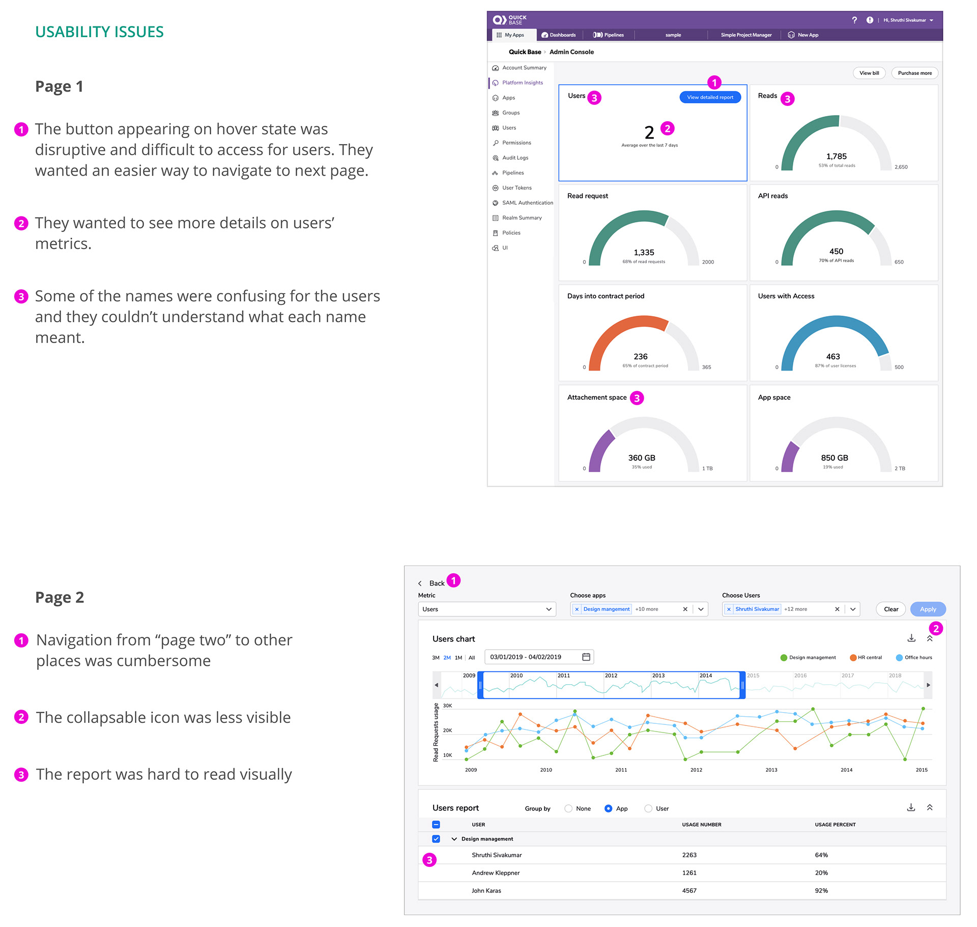
Final designs after usability testing
Design handoffs
The final designs were handed off to the developers through Zeplin (a tool through which developers can view code snippets). I also regularly inspected and monitored the designs with the developers to ensure that interaction and visuals are presented as required.
Outcome
This was presented as a keynote presentation during the Empower conference, one of the major events in Quickbase. It was well received by the customers. The customers showed great enthusiasm, leading to the project being included in the company's OKR for the following year. It was started as co-op project and it later became a separate team due to its success among the customers.
Click here to read the blog post about the platform insights
Click here to view the video empower presentation
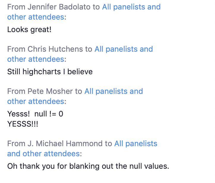
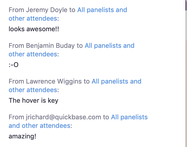
Comments from the customers